I have to disagree about user interface. The best user interface is the one which leads to the pilot to use it. Part 135 and 121 operators have the necessity of standardization. We don't. We can set them up with colors, varying fonts, no varying fonts, plain, fancy, one page, 10 pages, whatever leads us to actually use them.
I had a discussion with an instructor who asked the excellent question based on observation - why don't pilots use checklists? I've seen the same. Pilots who, once finished with the before takeoff checklist, put it aside, never to be seen again until the next flight. No use for post takeoff climb, cruise, descent, landing, after landing, shutdown.
I answered him. "Because most checklists suck. They reflect someone else's idea of what a checklist should look like, not what makes most sense to the specific pilot."
interesting that the checklists incorporated into avionics like the G1000 are phase of flight oriented. When you access the climb checklist, your eyes see inky the tasks associated with the climb. Not sure why you would think it would be better from a user interface standpoint if it is a bad idea unless it also showed the takeoff tasks which were already completed or the cruise tasks which come up later.
I'm not in any way suggesting it's bad to combine them. Just that it is not bad to not combine them if that's what a pilot finds is better for that pilot.
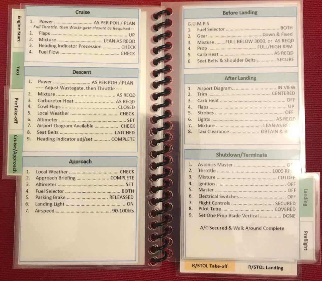
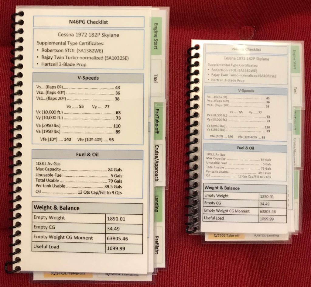
BTW, my own personalized normal op checklist is only two pages. But it is also so condensed that much of each page has quite a bit of white space.
Well, there's some art mixed in with the science on this topic, but there's a lot of science. The science suggests it's better to simplify, if possible. Also, you really can't mix electronic checklist concepts with paper. They don't go together at all. Most of us use paper in little airplanes. That has been my focal point for the conversation since that's what was presented to us in this thread. Electronic checklists are their own animal. For what it's worth, as a brief treatise, I don't use them in little airplanes. I experimented with them quite a bit, then stopped. I do use them at work.
Paper checklists: the science also suggests it's better not to subcategorize information in subpages, if at all possible, on paper checklists. Of course many aircraft are simply too complicated to do otherwise. One of the types I stay current in is the Gulfstream 450/550 series. I have an app on my iPad called Planebook which is continually updated by Gulfstream for the latest procedures. It's not awesome from a UI perspective, but it's pretty darn good, and they are continually tweaking the UI to make it better. Anyway, it's a surprisingly simple aircraft, at the end of the day, but the normal and emergency checklists are never going to fit on a single page. (Electronic or paper.)
But a Cessna 172? Yeah, it can fit on one page.
I attended a great symposium on fatigue in aviation. In it, the presenters debunked the most basic of all the common "myths" associated with fatigue. It had to do with forecasting fatigue and providing crews with sleep schedules. The myth was that pilots think they "do better in the evening anyway," or "better in the morning anyway," or "feel more alert at the end of the flight," or X, Y, or Z. This, in response to Fatigue Meter's assessment of the best time the crew should sleep on an international trip. But the performance metrics didn't agree with the pilot's personal assessment. In fact they were dramatically, and diametrically opposed. Pilots thought they performed well at certain times of day or after certain duty periods, but in fact, they did not.
That's true across the spectrum, actually. User interface has performance metrics associated with them. The way we interact with the equipment, with other crewmembers, and even checklists. You might personally think you'd do better with a spiral-bound, tabbed-out checklist with a lot of data associated with it, but probably, you don't. If that surprises you, you're not the only one. My first generation checklist that I used in my Twin Comanche used a large typeface, and color coded, across 10 or so pages of what I considered easy to read text. My emergency procedures were on different color pages (yellow, actually). I was pretty proud of it. Went through three big revisions before I settled on it. Used it for years.
Then my interest in Human Factors gave me exposure to some high level thinking on this topic. The way I designed my checklists for my Twin Comanche, the colors, the complexity, the simplicity, all of it. I went back to one double-sided piece of paper for all of my normal procedures, and a separate, distinctly different design (also one double-sided page) for my emergency procedures. There's a ton of stuff to consider. Not making the checklist too simple; not making it too verbose. Overdo it and the crew (or single pilot) tend to start skipping items which should have been consolidated. Underdo it, and important steps might be missed.
I think my performance is probably better. Not because I measure it that way, because subjectively, I can't, really. I can think whatever I want, believe that I know "what's best for me," but in reality my actual and perceived performance are probably different. I just know that under stress, my mind tends to work like a lot of other human brains, and that I picked a simple design which allowed me to utilize muscle memory to my advantage to go to the right checklist. And that study in this area suggests that's the best way to do it. I'm unlikely to use the wrong one. I'm unlikely to read checklist items in the wrong order because of the shading I used between columns and the small margins between the item and the action. I think I stacked the deck in my favor.
You did say a few things I agree with. "Most checklists suck." Absolutely. And quite a few COTS (Commercial Off the Shelf) checklists contain flat out
wrong information and are poorly formatted. Many legacy manufacturer checklists are woefully out of sync with modern thinking on checklist design. Sometimes it seems some random admin at the company in question, back in the 60s or 70s or whenever it was, just typed up the procedures they thought were best, in whatever random order came to mind. And electronic checklists absolutely should be phase of flight oriented, sequenced for correct utilization. Generally emergency procedures will call for leaving the electronic checklist to go to the QRH, even in modern business jets. This is true in the Gulfstream 450/550 as well as the Challenger 300/350, the latter of which is a more modern design. Ironically we now go from the electronic checklist on the MFD to the iPad rather than a paper emer proc checklist, but it's the same concept anyway. The iPad does make it simpler and faster to go directly to the needed emergency procedure. But once located, the user still simply "reads" the checklist on a static screen. It's not interactive.
Thanks for an interesting discussion!

")