You are using an out of date browser. It may not display this or other websites correctly.
You should upgrade or use an alternative browser.
You should upgrade or use an alternative browser.
ForeFlight version 8 has been released.
- Thread starter AggieMike88
- Start date
JGoodish
Cleared for Takeoff
- Joined
- Jun 10, 2006
- Messages
- 1,419
- Display Name
Display name:
JGoodish
The problem I have with what FF is doing is that they aren't being honest about it. When it was time for me to renew last year, I had to HUNT for the option to renew at my current Basic level, but had no problem locating the upsell to Plus or Pro plans. In fact, their web site didn't even offer me an option to renew the Basic plan, only the Plus or Pro plan. I'm pretty sure I posted a complaint about that obfuscation before.
In my opinion, whoever is directing their marketing/sales efforts is tarnishing their reputation with these tactics. Tyson's spin (which I've heard before) only makes it worse. Unfortunately, I suspect that they don't care as long as they like the numbers on the balance sheet. It's a shame.
JKG
In my opinion, whoever is directing their marketing/sales efforts is tarnishing their reputation with these tactics. Tyson's spin (which I've heard before) only makes it worse. Unfortunately, I suspect that they don't care as long as they like the numbers on the balance sheet. It's a shame.
JKG
RalphInCA
Cleared for Takeoff
Options, and premium products, are where the profit is. They are pushing us towards their most profitable products. Which, by the way, they are pretty sure we will like once we get past the grumbling about price. Seems like a pretty good business move to me.
Have you ever tried to buy a bare bones car? Almost impossible. You usually have to special order it.
Have you ever tried to buy a bare bones car? Almost impossible. You usually have to special order it.
wsuffa
Touchdown! Greaser!
It's aviation. Nothing that the airlines haven't been doing to their customers.
gsengle
Pattern Altitude
- Joined
- May 9, 2016
- Messages
- 2,099
- Display Name
Display name:
Gsengle
The reality is we've seen an astonishing amount of value created in just a few years. Compare the value of Foreflight dollar for dollar with a 15k panel installed TSO'd navigator. Sure beats carrying a chart case too!
I agree they could have done a better job with pricing tiers...
Sent from my iPhone using Tapatalk
I agree they could have done a better job with pricing tiers...
Sent from my iPhone using Tapatalk
Fearless Tower
Touchdown! Greaser!
Apples to oranges. There certainly is value, but you can file and fly an instrument approach with the $15k panel. Can't do that with FF or any other portable/tablet.The reality is we've seen an astonishing amount of value created in just a few years. Compare the value of Foreflight dollar for dollar with a 15k panel installed TSO'd navigator. Sure beats carrying a chart case too!
gsengle
Pattern Altitude
- Joined
- May 9, 2016
- Messages
- 2,099
- Display Name
Display name:
Gsengle
I'm talking about value. Of course it is apples and oranges. It's still amazing what you get for max $200 a year. What would every American chart for the entire country of every type have cost? Plus weather subscription? Plus flight planning tools, plus plus plus... It's just hard to listen to people complaining too much about one of the greatest bargains and fastest innovations in aviation...
I know complaining is just the way people are, but no one makes anyone pay any more today to get what you're already getting for a great price... And it just keeps getting better.
Interesting to note that my data subscription for the eastern half of the us for my 530w from jeppesen costs more than $199...
Sent from my iPhone using Tapatalk
Last edited:
GLMS_NC
Line Up and Wait
- Joined
- Apr 3, 2015
- Messages
- 561
- Display Name
Display name:
Rick
FF had been trying to raise the annual price so their approach is to start charging for new features. What I pay yearly covers r/d as the old development has already been paid from those prior year subscription dollars, but I have to pay again? Not going to do it.
I have pro with SV and I rarely use sv so I will drop that next renewal. FF now has to maintain two sets of maps - tell me how that is cheaper for them?
All I have read up to today was how great FF was. Now the old charts sux and we need new ones? I flew fine the other day with the old ones. And up to today no one was complaining about the charts.
I have started FltPlanGo and they are planning a series of training webinars. Don't need/use stratus2.
$199 buys lots of avgas at $3.47/gallon and I will gladly keep my own logbook.
Don Quixote
Filing Flight Plan
- Joined
- Aug 29, 2016
- Messages
- 17
- Display Name
Display name:
Don Quixote
They announced it months ago AFAIK. Making vector graphics out of FAA data isn't free, so I don't mind a price bump for that.
Yes agree. And it isn't just FAA... Those vector graphics are there WORLDWIDE. There is a lot of work that went into that.
RalphInCA
Cleared for Takeoff
Just curious, too lazy to look this up myself, do the other guys (GP, flyQ, etc) have pricing tiers?
RalphInCA
Cleared for Takeoff
Now the old charts sux and we need new ones? I flew fine the other day with the old ones. And up to today no one was complaining about the charts.
You flew just fine with the old charts, because that was all you had.
...and no one complained? I sure did. Not in any official way, but I grumbled a lot about how cluttered the VFR charts were and how hard it was sometimes to find the one little bit of data I needed. And how the overlapping charts (sectional / terminal) sometimes made things difficult. (Flying in the LA area makes this especially difficult. Our sectionals are very cluttered.).
gsengle
Pattern Altitude
- Joined
- May 9, 2016
- Messages
- 2,099
- Display Name
Display name:
Gsengle
Hey guys you're not thinking about it the right way. The whole point is that they don't have to make the vector maps. The computer dynamically renders them straight from the data. That's the whole point. The rasters was an old tech stop gap to scan the paper coming from the government. All that old school by hand work will go out the window soon.
Sent from my iPhone using Tapatalk
Sent from my iPhone using Tapatalk
Dave Theisen
En-Route
At $199, I think it's still one of the best deals in aviation. If you think that's too much, there are other options out there.
It amazes me what a cheap bunch of SOB's pilots are.")
It amazes me what a cheap bunch of SOB's pilots are.
Cogito
Pre-takeoff checklist
You're right, and that's why many on this forum are unhappy today. Vector maps are better for ForeFlight, just not better for pilots flight planning. As one example: If you look at airspace it only gives the shapes, not the heights or floors of the shelves. Maybe ForeFlight has implemented it differently than Garmin, but for GP you have to touch each individual section to know the information easily displayed at a glance on a chart. To me raster maps on iPad are the goldilocks situation between paper charts and vector maps. Agreed, paper charts aren't the answer, I've even tried to pinch and zoom them.Hey guys you're not thinking about it the right way. The whole point is that they don't have to make the vector maps. The computer dynamically renders them straight from the data. That's the whole point. The rasters was an old tech stop gap to scan the paper coming from the government. All that old school by hand work will go out the window soon.
Sent from my iPhone using Tapatalk
As I said before, vector maps are superior for flying, but for that I have G3X Touch displays. I want foreflight to support my EFIS, not try to replace it.
jjflys
Pre-takeoff checklist
Add me to the list of loyal subscribers now looking into other options. Like others I didn't want logbook or syn vis, and have Pro. I'm not impressed with Foreflight right now, I think this is truly a dumb business move...
simtech
En-Route
I don't get it...just keep pro if your happy with pro...I was a complainer too as I was a pro user. But $50 more bucks I upgraded, why not, was it worth it..IDK..but its only $50. I've wasted more on less! Plus after you pay it you will forget about the extra.
Cogito
Pre-takeoff checklist
It's funny, it was ForeFlight, Dynon, MGL, etc. that disrupted the business model and forced Garmin to make their subscriptions more reasonable. Now I expect the reverse will happen, many of us will switch to GP and ForeFlight might reconsider their pricing.
Or, out of inertia or laziness, we'll just keep paying more each year. Does anyone know how LogTenPro's subscription model ended up working out for him?
Or, out of inertia or laziness, we'll just keep paying more each year. Does anyone know how LogTenPro's subscription model ended up working out for him?
Last edited:
Don Quixote
Filing Flight Plan
- Joined
- Aug 29, 2016
- Messages
- 17
- Display Name
Display name:
Don Quixote
Hey guys you're not thinking about it the right way. The whole point is that they don't have to make the vector maps. The computer dynamically renders them straight from the data. That's the whole point.
And you know this how? Do you work for Foreflight? You've seen the code that does this? Or are you just guessing?
Lando
Pre-takeoff checklist
Foreflight has been rock solid for me and I have zero complaints. I get access to every chart I could need at any time of the day or night and the app has NEVER crashed while I've been using it in the air. There's no way they can make everyone happy and until their website switches from .com to .org the goal will be to maximize profits while providing a quality product. If I don't like a product I don't buy it anymore and I try something else...the free market is a beautiful thing.
Don Quixote
Filing Flight Plan
- Joined
- Aug 29, 2016
- Messages
- 17
- Display Name
Display name:
Don Quixote
That's what a dynamic data driven vector map is. It's the whole point.
And yes, I spent a career developing software and have a degree in computer science.
Sent from my iPhone using Tapatalk
So you're guessing? Based on your expert opinion?
James331
Ejection Handle Pulled
- Joined
- Apr 18, 2014
- Messages
- 20,309
- Display Name
Display name:
James331

New "Aeronautical" chart only:

HOLD UP!
So for VFR we all know lakes and rivers are one of the best landmarks... So why the heck did FF disappear Sturgeon Lake (major landmark) and all but disappear the frickin giant Columbia River (looks like MAYBE a creek) on their new maps?!
Do they think their demographic is going to be SOO glued to the screens that they don't care about the outside the window visual landmarks?? That would the the V of the VFR
That's a big issue
gsengle
Pattern Altitude
- Joined
- May 9, 2016
- Messages
- 2,099
- Display Name
Display name:
Gsengle
"Rather than using scans of paper charts, Aeronautical Maps are driven by data, opening up a huge range of possibilities for how information is displayed on the map."
https://blog.foreflight.com/2016/08...autical-maps-logbook-enhancements-tfr-alerts/
Sent from my iPhone using Tapatalk
https://blog.foreflight.com/2016/08...autical-maps-logbook-enhancements-tfr-alerts/
Sent from my iPhone using Tapatalk
Don Quixote
Filing Flight Plan
- Joined
- Aug 29, 2016
- Messages
- 17
- Display Name
Display name:
Don Quixote
No I'm not guessing. They've described it in plain English all over the place. That's what it is.
Got a link? I only saw reference to dynamic decluttering which is an entirely different beast.
midlifeflyer
Touchdown! Greaser!
Yes some do. You can search yourself easily enough for the details but, other than FF I think it's based mostly on VFR vs IFR functionality. FlyQ and I think Pilot does that. WingX used to but has now gone to single tier pricing.Just curious, too lazy to look this up myself, do the other guys (GP, flyQ, etc) have pricing tiers?
I think the gripe most folks have with FF's pricing comes down to the requirement to buy a bunch of things you don't care about in order to get something you do. Best example I can think of is georeferenced airport diagrams. Given the 20-year FAA runway incursion hot topic, one of the best things going for all pilots. FF only packages it with "Pro" so a VFR-only pilot who wants them is also paying for georeferenced instrument approach charts she doesn't really need. For one contrast, FlyQ prices VFR vs IFR and the VFR subscription includes the airport diagrams.
Don Quixote
Filing Flight Plan
- Joined
- Aug 29, 2016
- Messages
- 17
- Display Name
Display name:
Don Quixote
"Rather than using scans of paper charts, Aeronautical Maps are driven by data, opening up a huge range of possibilities for how information is displayed on the map."
Well of course the aero maps are driven by data and not scans of paper charts. This does not say how they got the data. You're still guessing.
Seeing that you're guessing, I'm also going to guess. These vector maps are worldwide from a variety of sources. I'm sure they have imaging processing software to aid them in capturing the vector outlines but am also quite sure but guessing that there are humans guiding the process and then other humans involved in QC. They're not going to have a process grind through multiple sources of different data from multiple agencies world wide, and then have it just automatically publish the databases to their users. What if there is a mistake?
Not trying to pick on you just saying don't assume there is not a lot of work that was done and a lot of work that is ongoing to support this new feature. It is a great new feature. I am prepared to pay for it.
It has a few shortcomings... For example airspace regions should have the altitude available, like the B floor and ceilings. I'm sure they will fix that.
gsengle
Pattern Altitude
- Joined
- May 9, 2016
- Messages
- 2,099
- Display Name
Display name:
Gsengle
You just changed the question. The reality is all the data is available commercially or from the government freely. It's the same way jeppesen works... It's not complicated.
https://www.faa.gov/air_traffic/flight_info/aeronav/aero_data/
Sent from my iPhone using Tapatalk
https://www.faa.gov/air_traffic/flight_info/aeronav/aero_data/
Sent from my iPhone using Tapatalk
AggieMike88
Touchdown! Greaser!
- Joined
- Jan 13, 2010
- Messages
- 20,805
- Location
- Denton, TX
- Display Name
Display name:
The original "I don't know it all" of aviation.
That was asked for in the thread on the AOPA forum. Tyson responded that the feature request has had lots of votes from many places and is high up on the improvements list.In the new mapping system, how can you see the floors and tops of controlled airspace? For example - the floor and top of a class bravo shelf? This is especially important for those of us in complicated airspaces like the LA area.
Pilawt
Final Approach
- Joined
- Sep 19, 2005
- Messages
- 9,480
- Display Name
Display name:
Pilawt
So use the new "Aeronautical" map layer over the sectional chart background, as in the third screenshot I posted. You have all the terrain features of the sectional, plus scalable, legible text always right-side-up even in track-up mode, and easily-discernable SUA boundaries. Turn the sectional chart on when you want terrain detail, turn it off when you want minimum screen clutter.Do they think their demographic is going to be SOO glued to the screens that they don't care about the outside the window visual landmarks?? That would the the V of the VFR
I use an iPhone in a yokemount for basic magenta-line following, and this will ease the eyestrain considerably. I tried it and I like it.
Last edited:
AggieMike88
Touchdown! Greaser!
- Joined
- Jan 13, 2010
- Messages
- 20,805
- Location
- Denton, TX
- Display Name
Display name:
The original "I don't know it all" of aviation.
Yes. At least WX and GP do.Just curious, too lazy to look this up myself, do the other guys (GP, flyQ, etc) have pricing tiers?
Don Quixote
Filing Flight Plan
- Joined
- Aug 29, 2016
- Messages
- 17
- Display Name
Display name:
Don Quixote
That was asked for in the thread on the AOPA forum. Tyson responded that the feature request has had lots of votes from many places and is high up on the improvements list.
That is good to hear. This is my number one issue with it right now. They need to get on this because the way it is now it is not useful for flying around where there is Bravo airspace for example because you can't see where the vertical limits are. I wouldn't use it where it would be most useful for me.
James331
Ejection Handle Pulled
- Joined
- Apr 18, 2014
- Messages
- 20,309
- Display Name
Display name:
James331
So use the new "Aeronautical" map layer over the sectional chart background, as in the third screenshot I posted. You have all the terrain features of the sectional, plus scalable, legible text always right-side-up even in track-up mode, and easily-discernable SUA boundaries I use an iPhone in a yokemount for basic magenta-line following, and this will ease the eyestrain considerably. I tried it and I like it.
I'm keeping my old version, mainly because I'm on a jail broken device and don't want to loose my jailbreak and performance on a new iOS.
That said, not having MAJOR landmarks on any VFR chart/map/layer is a cardinal sin of cartography
Fearless Tower
Touchdown! Greaser!
I can see the value of the straight aeronautical map for folks who are using FF in the air on their iPhone, but overlaying the aeronautical vectors on top of the raster sectional looks like crap.So use the new "Aeronautical" map layer over the sectional chart background, as in the third screenshot I posted. You have all the terrain features of the sectional, plus scalable, legible text always right-side-up even in track-up mode, and easily-discernable SUA boundaries I use an iPhone in a yokemount for basic magenta-line following, and this will ease the eyestrain considerably. I tried it and I like it.
Don Quixote
Filing Flight Plan
- Joined
- Aug 29, 2016
- Messages
- 17
- Display Name
Display name:
Don Quixote
Just touch the spot your curious about and you can see the airspace heights. Or turn on the sectional layer.... It is there, just that you have to tap for it...
I don't think so... If I tap nothing comes up. Also I agree with Fearless Tower the aero map overlayed on the sectional looks terrible. Even more cluttered than before.
gsengle
Pattern Altitude
- Joined
- May 9, 2016
- Messages
- 2,099
- Display Name
Display name:
Gsengle
I don't think so... If I tap nothing comes up. Also I agree with Fearless Tower the aero map overlayed on the sectional looks terrible. Even more cluttered than before.
Here you go...
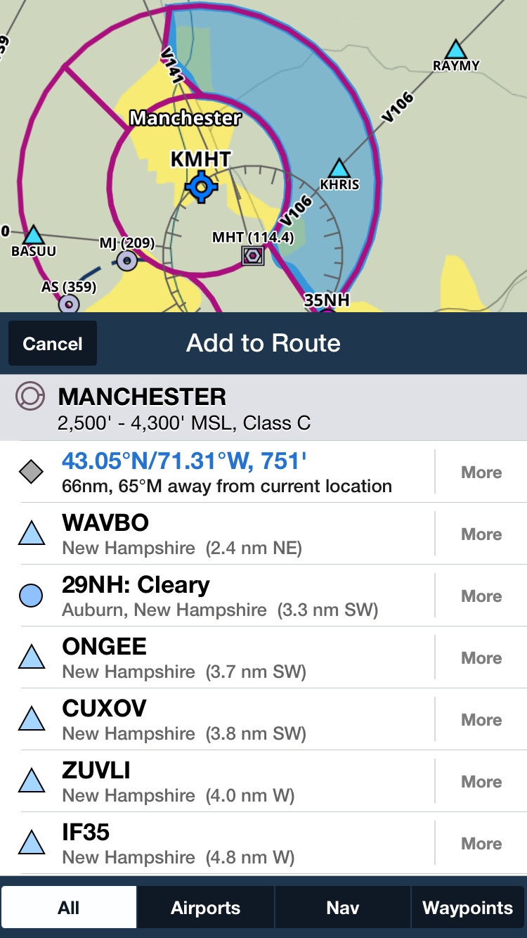
Sent from my iPhone using Tapatalk