So, how bout that new logo?

ebykowsky

Cleared for Takeoff
Joined
Dec 12, 2012
Messages
1,405
Display Name

Display name:
goalstop
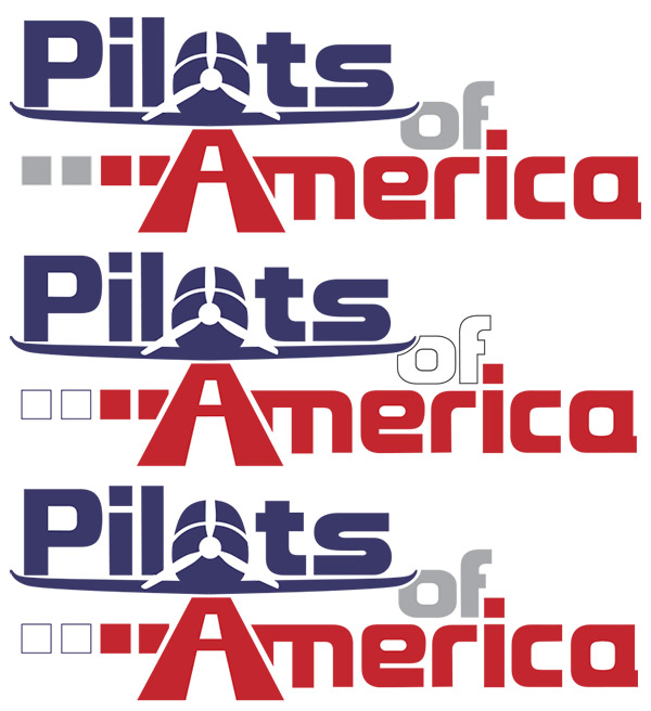
After the thread on a new logo for PoA, how do we go about seeing if we should change the logo? I love the ones Shane came up with and wanted to get the ball rolling. I figure an admin should make a poll or something on which one we want (old logo or new) and go from there. Don't want all that great artistry to go to waste!
 
Here is the final version that everyone seemed to like. I'll leave it here too and you guys just let me know if you need anything.

Logos_Concept3-EvoC-PoAForums.jpg
 
Here is the final version that everyone seemed to like. I'll leave it here too and you guys just let me know if you need anything.

Logos_Concept3-EvoC-PoAForums.jpg

That's very good! It might look better if you added wings to the plane, perhaps a low-wing so that they double as a graphic separator between PILOT and AMERICA.
 
That's very good! It might look better if you added wings to the plane, perhaps a low-wing so that they double as a graphic separator between PILOT and AMERICA.

That would be nice, although I especially like the PAPI he incorporated into the side of the runway.
 
Hmmmm, maybe something a lil mo law enforcemency looking for no joy and I.:D


Sike, just playing. Very nice as is. Promote now.
 
That would be nice, although I especially like the PAPI he incorporated into the side of the runway.

Shane and others, it needs some more jiggling, but what do you think of some wings, maybe something like this?

poa_rev02.jpg
 
Last edited:
I like the wings showing.
 
I prefer it with wings, too. Not sure which version of the wings, though.
 
Very impressed!

However, in order to prevent the high wing, low wing debate, what if a mid wing design was incorporated?

Maybe something across the "T"?

There may be debate, but there is no reasonable way to dispute the symmetrical beauty of a low wing. I will admit that a high wing has some functional value in some applications, though. :D
 
Very impressed!

However, in order to prevent the high wing, low wing debate, what if a mid wing design was incorporated?

Maybe something across the "T"?

That risks having a mid-wing debate. How about a flying wing? :D
 
BTW, I think the wings do finish it a bit, so I will vote for the wings. Are we voting?
 
Shane and others, it needs some more jiggling, but what do you think of some wings, maybe something like this?

poa_rev02.jpg

I really like it, but I'm not a huge fan of how the wing intersects the "o" in "of." It almost looks like a mistake to me. That said, I really love the rest of it! And having a wing is much better than not. Even though I've never flown a low-wing airplane, the visual separation it provides here I think wins out.
 
Here you go!

Concept 3, Evolution D:

Logos_Concept1-PoAForums-1.jpg

Shane, here's a tweak of a positive-wing version of your awesome logo, with the leftmost "PAPI" lights in white as suggested by TW, and with the O carved out by the wing tip rather than by the S.

Just some thoughts...

POA%20Logo%20Rev03.jpg
 
I agree, eetrojan's contribution is the best yet. Though it does make all my PoA branded paraphernalia a curiosity! And Dave S is going to be peeved, since he bought his plane specifically to match the old logo!
 
Last one is good, although I like the original red and grey colors (except the white PAPI is nice). That wing has appropriate thickness and dihedral too!
 
Shane, here's a tweak of a positive-wing version of your awesome logo, with the leftmost "PAPI" lights in white as suggested by TW, and with the O carved out by the wing tip rather than by the S.

Just some thoughts...

POA%20Logo%20Rev03.jpg
Overall, an exceptional design, but this last tweak cinches it, IMHO. Looks very modern and clean at first glance, while it also then incorporates a lot of detail upon closer inspection. That's the best recipe for a logo in my mind...
 
Based on some comments, here are a few sided-by-sides of the tweak to Shane's logo with the "of" and the white PAPI lights in different colors, namely gray-gray, white-white, and gray-white:

POA%20Logo%20Rev03%20-%20Versions%20A,%20B,%20C.jpg
 
Changing the logo will do little to refresh the site.

The site needs a top down new look not a fancier logo.

Also consider adding some functionality.

Photo gallery of all aircraft-
Photos -member wall of fame where we all list our own aircraft for the rest to see.
list of all GA aircraft with specs for each aircraft, typical mission.

This adds value to users.
 
Based on some comments, here are a few sided-by-sides of the tweak to Shane's logo with the "of" and the white PAPI lights in different colors, namely gray-gray, white-white, and gray-white:

POA%20Logo%20Rev03%20-%20Versions%20A,%20B,%20C.jpg

I vote for the middle one, since the 'of' adds to the "red white and blueness" of the logo.
 
I like the general wing shape of the silhouette in the earlier version. It's in proportion to the fuselage and the dihedral is elegant. The solid wing doesn't look like it would support the fuselage and the word "Pilots" is not balanced on the wing, which is slightly distracting to me. All in all, a pretty good design though.
 
Back
Top