Repaint the Yellowbird?

Yellowbird

Pre-takeoff checklist
Joined
Apr 27, 2010
Messages
296
Location
Wooster, OH
Display Name

Display name:
Yellowbird
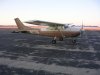
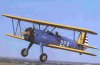
I've posted this on the Red and Purple boards over the last few days, but for those who are exclusively blue, I'm looking to get Yellowbird repainted and am considering options for a new design. this is what she looks like now - the original and well worn 1974 factory scheme:

attachment.php


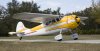
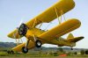
Considering a new scheme, the only hard requirement is that yellow still be a prominent color, otherwise I'd have to rename her.. Unfortunately, I couldn't imagine a modern scheme that I liked with a lot of yellow in it. In the midst of the discussion on one of the boards, somebody posted a picture of their Cessna 195, and that reminded me of one of the classic 195 schemes in yellow over white (or bare metal in the originals). So, with this as inspiration...

attachment.php


...and with some help from Jeff Jacobs (Pilawt), I've come up with this:

attachment.php


And here it is with a large N-number, although I'm not set on the style or color of the numbers:

attachment.php


Comments? Ideas?
 

Attachments

  • 177Orig.jpg
    177Orig.jpg
    38.5 KB · Views: 275
  • 195Orig.jpg
    195Orig.jpg
    261.8 KB · Views: 274
  • final12.jpg
    final12.jpg
    120.7 KB · Views: 273
  • final14.jpg
    final14.jpg
    125.8 KB · Views: 272
Those options both look very good. And I agree about the 195 - I'd happily get a tail wheel endorsement to fly that.
 
Looks like you favor the traditional straight line schemes, and the samples you've posted are great. Just in case you've not seen one, I thought you might like to consider the new "ribbon" type of scheme. It can provide more white area (many technical advantages), and make a plane look newer. We also used a darker color on the cowl top to reduce glare, and on the belly to hide soot and oil mist between cleanings plus added visibility from below.

The SB Flying Club 172 was nicknamed "Rusty" for reasons you can guess in this 2008 Before pic:
rusty-cowl-top.jpg


A few months later, we'd done a ribbon scheme and her new name was "Flash."
1695-1705-53-37.jpg


Many casual observers thought this was a new aircraft, and it gets many positive comments.
 
Just make sure you paint BOTH prop tips. ;-)


Think about it: From the side, you'll see the front of one blade and the back of the other. You only paint the tips on the front, so I only painted the tip on the blade with the front visible.

Got it? :wink2:
 
Last edited:
Looks like you favor the traditional straight line schemes, and the samples you've posted are great. Just in case you've not seen one, I thought you might like to consider the new "ribbon" type of scheme. ...

I loooked at a lot of the newer designs with more curves. They do help hide the boxiness of a 172, but I don't like them as much on a Cardinal. The Cardinal is sleek enough - to my eye, long graceful curves and straight lines look better on a Cardinal.
 
I loooked at a lot of the newer designs with more curves. They do help hide the boxiness of a 172, but I don't like them as much on a Cardinal. The Cardinal is sleek enough - to my eye, long graceful curves and straight lines look better on a Cardinal.

I think you're right about that. The curves wouldn't look as good as your design.
I like the first one better. The large numbers seem a jarring contrast, especially if you leave them black. Are you intending to have yellow as the only colour?
 
The large numbers seem a jarring contrast, especially if you leave them black. Are you intending to have yellow as the only colour?

Well, she is the Yellowbird. :wink2:

As for the numbers: if I go with large ones, they won't be solid black. I just haven't come up with anything else yet.
 
I don't think people should get all too artsy craftsy with airplane paint designs. There was an almost brand new Archer for sale in San Diego that they had done some weird paint scheme on, the paint looked like something melting over the plane, and on the control panel as well. I know that paint scheme delayed its selling for quite some time. Very ugly.

Your design looks beautiful and makes a whole lot of sense. I'm not big on waves and ribbons when applied to older planes. They do look nice, but I get a feeling that those older birds should not be painted that way. Perhaps it's like having a classic car like a woody, then doing a modern day paint design on it. It might look nice, but it never feels right.

John
 
Sharp looking design, Yellowbird. Of course, I have always thought the Cardinal was the best looking of the modern era Cessna singles.
 
I don't think people should get all too artsy craftsy with airplane paint designs. There was an almost brand new Archer for sale in San Diego that they had done some weird paint scheme on, the paint looked like something melting over the plane, and on the control panel as well. I know that paint scheme delayed its selling for quite some time. Very ugly.

John

Here is a link to a very similar paint job. At first I thought it was the same plane, but this one does not have it spreading to the control panel.

http://www.controller.com/listingsd...-ARCHER-III/2002-PIPER-ARCHER-III/1172873.htm

Whoever is doing this must be getting paid off by Cessna.

John
 
Here is a link to a very similar paint job. At first I thought it was the same plane, but this one does not have it spreading to the control panel.

http://www.controller.com/listingsd...-ARCHER-III/2002-PIPER-ARCHER-III/1172873.htm

Whoever is doing this must be getting paid off by Cessna.

John

I don't get that one at all - the paint is peeling, and underneath it all, the plane is made of jigsaw puzzle pieces? I had a dream like that once when I had the flu.
 
Any chance you could resize them to tolerable sizes or remove them? It pretty well busts the page for most people when you include gigantic images. I know there are other colors but a yellow stearman is a beautiful thing in most people's eyes.
 
Any chance you could resize them to tolerable sizes or remove them? It pretty well busts the page for most people when you include gigantic images. I know there are other colors but a yellow stearman is a beautiful thing in most people's eyes.

Just pulled them off the net. Blame Google.

Yellow airplane.

vomit-boy02-vomit-puke-sick-smiley-emoticon-000653-large.gif


Way to ruin a nice Stearman.
 
Well, we're finishing up with the annual this week and Yellowbird has a date with the painters on the 14th.
I still haven't settled on a new scheme. This is the one I was toying with last year, based on one of the Cessna 195 factory schemes:
final14.jpg

I've tried it with a small N-number on the tail, and with red stripes. Sometimes I like it, sometimes I'm not too sure...

Lately, I've been playing with this one:
final16.jpg


The N-number treatment for either design is still open, and I haven't settled on a wheel pant pattern for the second design.
And I could scrap them both, and try something else, or even repaint her in her original scheme.
Any ideas?
 
final14.jpg

I've tried it with a small N-number on the tail, and with red stripes. Sometimes I like it, sometimes I'm not too sure...

Lately, I've been playing with this one:
final16.jpg

I like the first one. Pretty sharp! And it is somewhat reminiscent of an actual Yellow Cardinal:

attachment.php
 

Attachments

  • yellow_cardinal.jpg
    yellow_cardinal.jpg
    40.1 KB · Views: 78
Just pulled them off the net. Blame Google.

Yellow airplane.

vomit-boy02-vomit-puke-sick-smiley-emoticon-000653-large.gif


Way to ruin a nice Stearman.

Frankly, the only way a Stearman should look is either the classic Army Air Corps theme (which has a LOT of yellow and is my preference, probably 'cuz that's how the first one I flew was painted), or the classic Navy theme (which is all yellow):

attachment.php

attachment.php
 

Attachments

  • army%20stearman.jpg
    army%20stearman.jpg
    24.9 KB · Views: 78
  • stearman.jpg
    stearman.jpg
    45.3 KB · Views: 77
The SB Flying Club 172 was nicknamed "Rusty" for reasons you can guess in this 2008 Before pic:

A few months later, we'd done a ribbon scheme and her new name was "Flash."

Many casual observers thought this was a new aircraft, and it gets many positive comments.

Same with our club 182. The "before" pic, when she was known as "the flying turd":

attachment.php


And after, which is how most PoA folk have seen her:

attachment.php


BTW, this was done via an all-white paint job, and then the N number and striping was done by Air Graphics - They're decals, so you can change the scheme easily. That way, if you're selling the airplane, the buyer knows they can change the look cheaply if they don't like it. :)
 

Attachments

  • flyingturd.jpg
    flyingturd.jpg
    90.1 KB · Views: 78
  • N271G parked on grass.jpg
    N271G parked on grass.jpg
    84 KB · Views: 228
Last edited:
AFA a serious comment about your paint schemes, I prefer the black striping. The red doesn't work for me. The yellow and black is very crisp.
 
I prefer the top one (black stripe) also. I really don't like all white planes that much though, so I think I like the top one because it has more color.
 
Scott: the yellow and black scheme (derivative of the 195 you showed) is absolutely stunning, looks better than the yellow and red, and I believe will age better than any "modern" design (at some point, someone's gonna say, "I'm really sick of all these swoops and dips on airplanes."). I really love the way the design is echoed on the wheel fairings.

Fact is, the design really seems to complement the Cardinal's beautiful lines, a melding of the old and the (relatively) new.

I'd still be tempted to use the smaller N-number on the tail, but it's not a big deal.
 
So what are the disadvantages of going with a small n-number?

Only one I can think of is, if you cross the border, you have to have 12" numbers on the plane when you fly back. Dave Taylor uses electrical tape.
 
Back
Top