New sectional charts on SkyVector

Mike I

Line Up and Wait
Joined
Oct 10, 2010
Messages
612
Location
NYC
Display Name

Display name:
Mike I
Seems SkyVector.com has the "new" digital-origin sectionals and TAC charts online, as opposed to the scanned versions. I'd imagine these will roll out to the EFB products soon. They look great!
 
Holy crap those look so much better! There goes the rest of my workday...
 
Garmin Pilot on my android got the new charts yesterday, and yes, they're fantastic.

Sent from my Nexus 7 using Tapatalk
 
Skyvector only has them on the individual sectionals and enroute charts. Not the "world VFR."

The World VFR, along with the handful of charts not valid until AIRAC 1404, will be in the new format on 0901Z April 3.
 
Cool, now people will be able to see exactly which contour line on the mountain they'll hit while staring at their EFB.

:stirpot:
 
Ooh, that is pretty, when you zoom in all the way on a sectional. Then switch to the World VFR and you realize how ugly it was by comparison.

The WAC is also now the vector-object version.

I'm not sure about the low enroute chart, though. The world and sectionals look about the same for that kind.
 
Last edited:
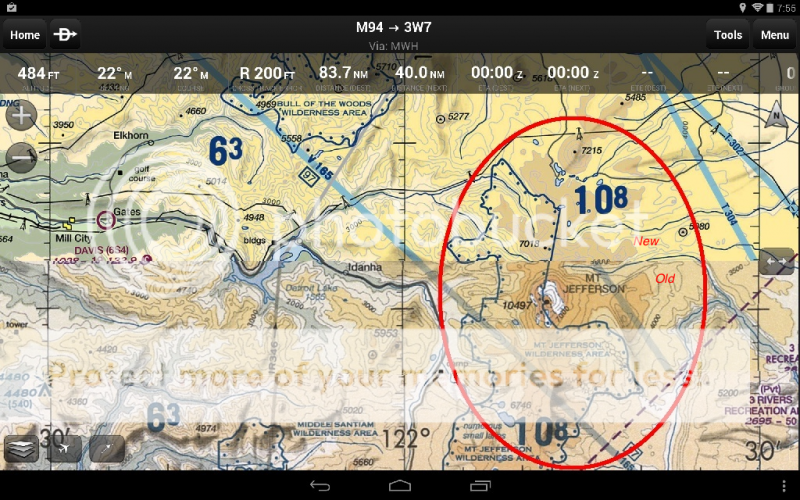
The new charts look much better for GPS navigation, but take a step backward for pilotage.

For instance, in the chart below, the top is new and the bottom is old. The contour lines and river valleys are more pronounced on the old. Good for pilotage.

The airways are depicted much better on the new (top) and better for GPS navigation


Screenshot of Garmin Pilot on Android.
 
Last edited:
Detroit's still the old-school scanned image, but maybe the fact the new chart comes out on Thursday may be the reason.
 
Detroit's still the old-school scanned image, but maybe the fact the new chart comes out on Thursday may be the reason.

That is correct. Detroit's getting a change to its Class Bravo, so it gets new TAC, FLY, Sectional, even Heli on 4/3.
 
The new charts look much better for GPS navigation, but take a step backward for pilotage.

I disagree. I took a look at several spots with a lot of high altitude relief. There are many fewer contours, but the valleys are much easier to see. Check out Mammoth Pass (west of KMMH) and Tioga Pass (next to the north) on Skyvector, using World VFR and the San Francisco sectional.
 
You may disagree, but you are wrong. All one has to do is look at Mt. Jefferson.

 
Last edited:
You may disagree, but you are wrong.

If you can't dodge 5000 foot peaks with an isolated big one in VFR conditions, maybe the rocks aren't for you.

Where it really counts is near the service limit, and it's a lot better there.

You did actually look, right?

As for Mt Jefferson, I don't see a direct comparison. All your 'new' stuff is below 7000 and almost all is below 5000.
 
Clearly you never had to use pilotage in adverse weather, just like most new pilots.

If you want me to look at something....post it. Don't try your usual runaround.
 
Detroit's still the old-school scanned image, but maybe the fact the new chart comes out on Thursday may be the reason.

Haha... I already thought that it doesn't make that much of difference... :lol:

The San Francisco sectional, for example, has however already been updated and looks really pretty. :yes:
I however agree with Skywag, that terrain features are less pronounced and that this might make them less suitable for pilotage.
 
In thinking the download sizes should be vastly smaller now...
 
In thinking the download sizes should be vastly smaller now...

I don't know....they seemed like they were larger. They're not vector based. They're better resolution bit maps, from what I can tell. That would mean a larger file size.

 
I don't know....they seemed like they were larger. They're not vector based. They're better resolution bit maps, from what I can tell. That would mean a larger file size.

Argh, ok, based on the appearance, I thought they were vector based...
 
They're now 300dpi instead of the old 200dpi versions. However since they don't have the artifacts that the old versions did from the scanning they compress better. Overall it looks like maybe 10% larger in my system for what ends up being twice as many pixels. But if vendors change/optimize compression they can probably get them a bit smaller.
 
They have a couple stitching bugs...one right by where I live.

Here's their "stitched" "World VFR":
attachment.php


Notice that little line heading off from the south end of Oak Ridge there...

Well, here's the Atlanta chart:
attachment.php


They've overlaid the Cinci chart over top and cut off the "NOTICE" box.
 

Attachments

  • world.png
    world.png
    337.4 KB · Views: 168
  • ATL.png
    ATL.png
    111.5 KB · Views: 167
Happens all the time with stitched charts. There's all sorts of stuff cut off around transitions from Terminal Area charts to Sectionals in Foreflight.

I have been wishing for a way to "peel away the layers" since day one of my Foreflight use. I believe I even sent it in as a formal request. I'm okay if they make it my job to review the layers pre-flight. I'm not so okay with the information just disappearing at a particular zoom level.
 
Back
Top