EricBe
Pre-takeoff checklist
- Joined
- Jul 29, 2013
- Messages
- 369
- Display Name
Display name:
Eric Berman
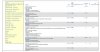
I've also added is a "beta playground" where I can start playing with alternative user-interface models that might work better. I've long felt that the MyFlightbook user interface is, well, shall we say "vintage"? The most important area for a refresh, IMO, is the main logbook page. So please check out http://myflightbook.com/logbook/Member/LogbookNew.aspx and send me any feedback. It's your live logbook (and the graphics are just as function-over-form as always), only the UI is different - mostly in that it lets you do more on a single page, it's a more integrated view. But I hope the flow might be a bit cleaner. This is a playpen of sorts, so you will experience a jolt when you cross the boundaries between the playpen and the legacy site, but my hope is that I can get some good feedback from you, tweak it and improve it, and over time move the UI from the 1990s into the 2000s sometime before we hit 2020. ") Please send me feedback, either here, or via the "Contact" link on the website!
Please send me feedback, either here, or via the "Contact" link on the website!
Please send me feedback, either here, or via the "Contact" link on the website!