Ugly paint be gone!

EdFred

Taxi to Parking
Joined
Feb 25, 2005
Messages
31,402
Location
Michigan
Display Name
The Ed
Home Airfield
9D9 / 6Y9 / 88TN
I'm pretty sure the Ugmanche might get an exterior makeover this year, and am looking for any creative types out here for input on schemes.

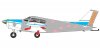
Blank templates are here:
Profile
Overhead

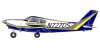
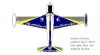
My first rendition...
Profile
Overhead

Yeah, I know I could pay someone 2 grand to design something, but I've looked at hundreds and not seen anything that jumps out at me.
 
Not bad, but need to adjust the arc line on the profile - too shallow of an angle at the front compared to the aft part of the fuselage - makes it look like the plane is pregnant.
 
Your first rendition doesn't look half bad to me, but I think that black with white is a pretty stark contrast. Perhaps expand the gold a bit.

I really like the paint scheme on the 310. I think the colors wouldn't match your plane well, but you might be able to get some ideas from the general scheme:

lift-off-11.jpg


Edit: Yes the numbers change color from back to front, one of the coolest parts of the paint scheme in my opinion.
 
Those numbers just gave me vertigo!
 
Not bad, but need to adjust the arc line on the profile - too shallow of an angle at the front compared to the aft part of the fuselage - makes it look like the plane is pregnant.

Yeah, I suppose I could take that black and gold and start it from the middle of the spinner...
 
Edit: Yes the numbers change color from back to front, one of the coolest parts of the paint scheme in my opinion.

Cool, but not legal, IMHO.

:(

N-Number Legibility. The N-number is required to be legible and written in capital Roman style letters without any ornamentation. You may use shading or a border only if it makes the number more legible....

The FAA considers a 12-inch number legible if you can read it from 500 feet away, in a horizontal line, and perpendicular to the side of the aircraft during daylight hours, without using an optical aid such as binoculars.

More here: AC 45-2D
 
"This AC is not madatory and does not constitute a regulation."

:)
 
My first rendition...
Profile
Overhead

Speaking as the owner of a black vehicle, I'm thinkin' that much black on an aircraft is a bad idea. That said, I like the look of it in the overhead view. I don't like it much in profile. Of course, it would be an improvement over the existing so I'm sure we don't want to stifle the change.
 
I didn't know painting an aircraft had to get approved by the FSDO.
 
Looks nice Ed. I myself would recommend black and grey over black and gold, the latter sounds too much like something from pimp my ride. You might look at straightening the lines a bit, I think that would look good on the Comanche.

Of course, feel free to utterly disregard my ramblings. However, I might be able to volunteer the services of Mrs. Steingar, who was a graphic artist in another life and does have a remarkably good eye for color.
 
The term "paint" does not seem to show up in part 43.

In fact, the term "paint" only shows up once in part 25, and twice in part 147.
 
Hell "Decorative Finishes" not found on balanced control surfaces is preventative maintenance so owner operator allowed.

Recovering a fabric plane is a major repair.

My only paint advice is keep all paint lines off of any screws or 1/4 turns. Ends up being a PITA to keep things lined up.
 
You would be correct (and have been the whole time as you knew) but that's where you find what repainting would be. Unless someone wants to argue that paint isn't a decrotive finish anyway:idea:
 
I like the scheme, would look good in real life. Can't say I'm all that crazy about the font of the numbers.

Gary
 
I would keep the tops of the wings more or less white just because of temperature issues but then again, you live in Michigan. Besides, the tops of the wings are not that visible.
 
Wow, looking at that first scheme, I'm expecting Ed to land at any and all fly-ins, disembark, and say "I'm Batman." :rofl:

I kinda like it, though - The top view, at least. It's almost SR-71ish. The side reminded me a bit of Ted's Seneca (not dog Ted, airline Ted! JuggyJet) which is a pretty good-looking plane.

Ed, you may want to consider painting the top of the cowl a dark color (I think it is now, right?) to avoid a lot of unnecessary brightness when flying toward the sun.

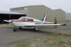
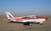
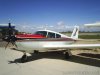
That said, I also really like the classic Comanche look, or the takeoffs on it:

attachment.php


attachment.php


attachment.php


So, I'd start with something like that, and maybe add some curves to the back half. But that's just me.
 

Attachments

  • 89405015.jpg
    89405015.jpg
    127.7 KB · Views: 166
  • 80090179.jpg
    80090179.jpg
    116.1 KB · Views: 165
  • .watermarked_ccf6d2584618b5156bf2a2f8ee368c7e.jpg
    .watermarked_ccf6d2584618b5156bf2a2f8ee368c7e.jpg
    46.8 KB · Views: 166
RealTree (TM) Camo????

Would fit right in with the natives in Sidnaw :D
 
I agree with steingar that black and gold has something from pimp my ride. :rolleyes: :D

I also think that this might be a combination of which you might be fed up after some time. A more timeless paint shop might be not as exciting at the beginning but more satisfying on the long run. This might also improve the aircraft's value in case you would like to sell it one day.

The design on the 310 looks great IMHO!

This classic look might also be a good starting point:

aero_IGD.php
 
I'm pretty sure the Ugmanche might get an exterior makeover this year, and am looking for any creative types out here for input on schemes.

Blank templates are here:
Profile
Overhead

My first rendition...
Profile
Overhead

Yeah, I know I could pay someone 2 grand to design something, but I've looked at hundreds and not seen anything that jumps out at me.

Are there any particular colors you want? Any you DON'T want? same with combinations etc...
s
 
Ask Phil Knight how it worked out for him when he tried to slip one by the Long Beach fed. NIKE looks a lot like N1KE, wouldn't you say?


I didn't know painting an aircraft had to get approved by the FSDO.
 
I'm required to carefully examine numerous paint jobs each year. Dark colors on leading edges and wear areas (around fuel tanks, inspection panels, access doors, etc. show chips and wear much more than similar areas painted with light colors. I'd paint all such areas with Matterhorn white and add trim accent colors to your liking.
 
Ask Phil Knight how it worked out for him when he tried to slip one by the Long Beach fed. NIKE looks a lot like N1KE, wouldn't you say?

Probably because tail numbers can't end in three consecutive letters, nor do they contain India or Oscar.
 
I'm required to carefully examine numerous paint jobs each year. Dark colors on leading edges and wear areas (around fuel tanks, inspection panels, access doors, etc. show chips and wear much more than similar areas painted with light colors. I'd paint all such areas with Matterhorn white and add trim accent colors to your liking.

That's a good point. Unfortunately I greatly dislike one wing having black on it, and the other not (wingwalk) and wanted to balance that somehow. I did plan to wrap the gold on the wing around the leading edge. Surprisingly on my current paint job the leading edge flecks are minimal on the leading edge, and the paint is 30+ years old. It's just coming off in other areas.
 
Obviously don't know about your plane, but many older airplanes have been touched up over the years, with the result that the worst-looking (or disappearing) paint is as you describe.

That's a good point. Unfortunately I greatly dislike one wing having black on it, and the other not (wingwalk) and wanted to balance that somehow. I did plan to wrap the gold on the wing around the leading edge. Surprisingly on my current paint job the leading edge flecks are minimal on the leading edge, and the paint is 30+ years old. It's just coming off in other areas.
 
heres an idea...
sorry I've only got ms paint and haven't used it in a few years...
 

Attachments

  • sideblankJM.JPG
    sideblankJM.JPG
    36.6 KB · Views: 36
  • overheadblankjm.JPG
    overheadblankjm.JPG
    17.3 KB · Views: 33
Cool, but not legal, IMHO.

:(

Fortunately, the inspectors who have seen the airplane disagree with you.

It's been that way for about 15 years, and nobody's complained.

Even if you didn't want to do the same morphing letters, you could just as easily make them a solid color and the paint scheme would still look cool.

Also, if you note, there are a number of aircraft that don't follow that AC at all and don't use the 12" letters at all.

14 CFR 45.22(b) allows any aircraft that is at least 30 years old to display N numbers at least two inches high.
 
Given that the airplane is a Hastings - Sidnaw commuter, I'm thinking one would want to go with the "assembled" look.


Say ya to da U.P. Eh?
 

Attachments

  • Assembled.jpg
    Assembled.jpg
    32.7 KB · Views: 31
  • overheadassembled.jpg
    overheadassembled.jpg
    16.9 KB · Views: 21
14 CFR 45.22(b) allows any aircraft that is at least 30 years old to display N numbers at least two inches high.

...and this one is 44 years old.
 
Back
Top