TAF Timeline Visualization Tool

flipfloppity

Filing Flight Plan
Joined
Mar 15, 2025
Messages
1
Display Name
flipfloppity
Hi all,

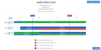
I've been working on a tool that allows visualizing METAR/TAF data at your departure/destination/alternate airports as a color-coded timeline view. I like seeing the data this way - I'm curious if anyone else finds this useful? You can see what the output looks like in the attached image.

In general I'm interested in building a more streamlined one-stop-shop briefing tool that can consolidate WX, NOTAMS, TFRs, and other advisories into a good summary document. I've always found it cumbersome to go through the entire briefing that Foreflight generates, for example - are there any existing tools that already do this?
 

Attachments

  • timeline.png
    timeline.png
    127.8 KB · Views: 63
Looks useful to me, I like the presentation too.
 
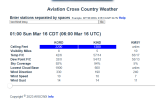
Is this what you are looking for? It gives weather based on METAR and TFF over a cross country flight plan for three days. There is s slide timebar at the bottom of the data.

 
Looks good but i'd like to see something like that along the entire route of flight too...
 
Hi all,

I've been working on a tool that allows visualizing METAR/TAF data at your departure/destination/alternate airports as a color-coded timeline view. I like seeing the data this way - I'm curious if anyone else finds this useful? You can see what the output looks like in the attached image.

In general I'm interested in building a more streamlined one-stop-shop briefing tool that can consolidate WX, NOTAMS, TFRs, and other advisories into a good summary document. I've always found it cumbersome to go through the entire briefing that Foreflight generates, for example - are there any existing tools that already do this?
I am kinda of curious, do you use Leidos? Seems like duplication to me.
 
Hi all,

I've been working on a tool that allows visualizing METAR/TAF data at your departure/destination/alternate airports as a color-coded timeline view. I like seeing the data this way - I'm curious if anyone else finds this useful? You can see what the output looks like in the attached image.

In general I'm interested in building a more streamlined one-stop-shop briefing tool that can consolidate WX, NOTAMS, TFRs, and other advisories into a good summary document. I've always found it cumbersome to go through the entire briefing that Foreflight generates, for example - are there any existing tools that already do this?
This tool does something similar, I've been using it for a couple years for longer XCs AVXCWX. It has a slider at the bottom where you can choose your departure time and see how it lines up. I think it uses TAFs and MOS data. I find it really helpful.
1742105281231.png

EzWxBrief also has a time-based visualization of flight conditions (circled at the bottom in blue). If you hover over a particular time it shows a breakout (I just can't capture it on screenshot).
1742105254570.png
 
flipfloppity said:
I've been working on a tool that allows visualizing METAR/TAF data at your departure/destination/alternate airports as a color-coded timeline view. I like seeing the data this way

Kind of like this?
 
My METAR map sitting in my front hall does this.
 
I think one useful tweak might be to make the end date/time default to the maximum TAF range (or change the UI input to a slider with a max), since I like to use tools like these for outlooks and seeing weather trend predictions. I'm trying to choose to do a trip tomorrow or Tuesday and the shifting TAFs on my route are making it troublesome. A visualization like this would help me out a bunch :)
 
Seems similar

IMG-6526.jpg
 
Back
Top