Please analyze this picture (N/A)

RJM62

Touchdown! Greaser!
Gone West
Joined
Jun 15, 2007
Messages
13,157
Location
Upstate New York
Display Name
Geek on the Hill
No, this isn't some kind of projective psychological test.

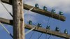
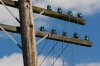
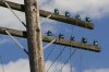
I took the attached picture, which has been rejected by almost every stock company I submitted it to, while some of my pictures that I consider far inferior have been accepted.

In a nutshell, the editors tell me that this picture is unsaleable because no designer would want a picture of broken telegraph wires. I maintain that the picture could very easily be used to illustrate a broad range of ... I'll just say "things," so as not to put any ideas into people's heads.

I'm just asking for people to suggest a few ideas that come to their minds when they they see this picture, or a few ways in which it could be used. In other words, what could it be used to symbolically represent?

I have my own ideas, which I'll list later.

The editors had no complaints about the technical quality of the picture in it's full-res version. They basically say that it's a very nice picture of broken telegraph wires, as pictures of broken telegraph wires go; but that no one would need such a picture. They don't see the symbolic potential that I do.

So... am I crazy, or are they dense?

Thanks,

Rich
 

Attachments

  • broken_telegrapgh_wires.jpg
    broken_telegrapgh_wires.jpg
    96.2 KB · Views: 184
A nice visual statement of the increase of mobile phones (aka radios) and rhe reduction of copper wire land line usage.
 
well I would get rid of the one wire in the bottom left. the 'broken' piece is not very strong. maybe if the ends were cut and visibly dangling? i would also add more contrast and maybe some HDR effect to make it more grunge and aged. otherwise - nice.
 
I'm just asking for people to suggest a few ideas that come to their minds when they they see this picture, or a few ways in which it could be used. In other words, what could it be used to symbolically represent?
Honestly the first thing that came into my mind was Mark Knopfler's song "Telegraph Road".

Of course the picture could also be used to illustrate broken lines of communication...
 
well I would get rid of the one wire in the bottom left. the 'broken' piece is not very strong. maybe if the ends were cut and visibly dangling? i would also add more contrast and maybe some HDR effect to make it more grunge and aged. otherwise - nice.

Actually, I did get rid of the wire in the one I submitted. I may try the HDR, as well. Thanks.

-Rich
 
Okay, two of my ideas already have been roughly validated:

1. Technological progress obsolescing older technologies.

2. Broken lines of communication (with other possibilities under that heading, which I'll keep to myself for now).

Thanks.
 
I'm just surprised those insulators are still there. :D
 
Okay, two of my ideas already have been roughly validated:

1. Technological progress obsolescing older technologies.

2. Broken lines of communication (with other possibilities under that heading, which I'll keep to myself for now).

Thanks.

Not being a photographer, it took a bit for the "stock photo" phrase to sink in enough to know how to respond. So I presume one way to frame (ahem) the question to be answered is "In what kind of advertisements would this picture appear to support some idea being presented?" Then those two ideas and their variants come first to mind. I'm almost tempted to write a fictional ad using it, but I'm not a copywriter either!
 
Henning was there in his cropduster chasing Doug in his water bomber.

Wof Wof!!
 
I see experimental aircraft wiring. :rofl:


Seriously, make it B&W, color hurts in this instance. Back off 100 years and shoot the entire line.

Nice pic. :D
 
The message is ok, the image is poorly proportioned and poorly lit giving it a completely unmemorable feel. Sorry, that's what I see, a snapshot of an electric pole some irate rancher took after a plane flew through his wires heading to the oil pumps. It looks like 1000+ courtroom exhibit prints I've made.
 
If I would have gotten that neg at a lab I would have printed it like this:
attachment.php


But I still wouldn't have liked the light, sun is far too high. You only have an hour before sunset and hour after sunrise you can shoot direct sunlight otherwise the effect is displeasing.

broken_telegrapgh_wires.jpg
 
Last edited:
Actually, I did get rid of the wire in the one I submitted. I may try the HDR, as well. Thanks.

-Rich

Call it a learning experience. Years ago, 21, just moved to San Diego and went to work printing for Victor Avila, funny little guy. I was printing a PPofA competition print for an outside photographer and just could not get happy with it. So I take 3 to Victor and ask him "What do I do? I can't make it look good." "Give this one to Yolanda to mount and ship. You can't make chicken soup from chicken ****." Go find the same thing with a dilapidated industrial structure in the background and shoot it with a long lens, add some depth and interest and get the sun down way lower.
 
Last edited:
It actually was not a planned shot. I was on my way to a railroad bridge spanning the Susquehanna to shoot it when the downed telegraph wires caught my eye. It was actually around 10 a.m., as I recall. Ironically, I wound up returning a couple of weeks later to shoot the bridge because I didn't like the light the first time, but I didn't think to re-shoot the pole.

The telegraph wires have been dead for years, but miles of them still stand here and there along the old Erie line (presently N&W and NYSW) from New Jersey, through Pennsylvania, and all the way up to Cooperstown. The crop that particular pole was in is maybe 35 miles west of me. I mean to go back there the next time I have some reason to travel west and shoot them again.

But the complaints I received weren't about the lighting. They were about the picture not meaning anything. I found that surprising because even while I was taking it, I was thinking of all the uses that I could find for a picture like that, as a developer.

What I thought the picture could represent included the following:


  • Technical progress / obsolescence of old technology.
  • Feelings of uselessness due to old age or disability.
  • Network or communications outages (literal).
  • Failures to communicate (figurative), including dysfunctional businesses and organizations, families, and so forth.
  • Broken friendships and/or desire to mend them.
  • Estrangement from family and/or desire to reconcile.
  • Divorce / separation.
  • Death of a trusted mentor.
These are the things I was thinking while I was taking the picture. (I know, Henning; I should have been thinking about the light instead. :D )

I can see that picture on a greeting card that seeks to reconcile a friendship, for example, or being used on a Web site for a business consultant specializing in improving communication and collaboration within organizations. I can even see it being used on a 404 page.

In short, I thought I had a real winner there. But while others of my pictures have been accepted and have sold, almost no one wants this one -- and I think it's one of my best. Was I really that far off in thinking this picture had symbolic value?

Oh, well... I guess that's why artists are the worst judges of their own stuff.

Here are two pictures of the railroad bridge (from the second trip), by the way. I kinda like them, although the media contact lady at the railroad seems to like them more than I do.

-Rich

EDIT: By the way, that bridge is a rare example of Warren truss construction, which was very seldom used in this part of the country.
 

Attachments

  • vestal_jc2_sm.jpg
    vestal_jc2_sm.jpg
    102.3 KB · Views: 33
  • vestal_jc1sm.jpg
    vestal_jc1sm.jpg
    120.9 KB · Views: 32
Last edited:
First thing that came to mind was it would be useful on a page that talked about communications issues. Title the page "Lines are down".

As someone else mentioned, the wire at the left detracts from the overall image, IMO. It is also a "dead wire" but it pulls attention to itself, rather than harmonizing with the rest of the picture. :dunno:
 
In short, I thought I had a real winner there. But while others of my pictures have been accepted and have sold, almost no one wants this one -- and I think it's one of my best. Was I really that far off in thinking this picture had symbolic value?
I can think of a few reasons why there was tepid reaction to this picture. Would the general public recognize this as a a telegraph line without some explanation? In the picture the lines are slack but you don't show the broken ends. It might not be immediately apparent that they are broken.
 
This is one of the versions with those wires removed, this one by cropping. I have another one somewhere that I airbrushed, instead.

-Rich
 

Attachments

  • 062612_2_sm.jpg
    062612_2_sm.jpg
    101.6 KB · Views: 21
I can think of a few reasons why there was tepid reaction to this picture. Would the general public recognize this as a a telegraph line without some explanation? In the picture the lines are slack but you don't show the broken ends. It might not be immediately apparent that they are broken.

That's true... not everyone knows what an intact telegraph line looks like, much less a broken one. I actually liked that one because it looked less broken than the rest -- as if it could be repaired relatively easily. That's probably because desire for reconciliation was one of the possible concepts for the picture that was on my mind.

There are plenty of poles not very far from here where it's more obvious that the lines are broken. Maybe I'll go shoot one tomorrow. Thanks!

-Rich
 
They do not see meaning because they won't look at it long enough, there is no draw, there is also nothing that displays the context that these are telegraph wires.
 
EDIT: By the way, that bridge is a rare example of Warren truss construction, which was very seldom used in this part of the country.
Reminds me of a Bailey Bridge. Strong as you could want, and fairly simple to construct once you got going.
 
Better hurry up with those "lines are down" metaphors. The kids today haven't ever used a non-cordless phone. ;)
 
This is one of the versions with those wires removed, this one by cropping. I have another one somewhere that I airbrushed, instead.

-Rich

Your vertical is still askew, it has the same effect on people as slipping an airplane on them in the back seat, what they see and feel of gravity are incorrect to each other and it creates 'motion sickness' causing people to look away.
 
What I thought the picture could represent included the following:


  • Technical progress / obsolescence of old technology.
  • Feelings of uselessness due to old age or disability.
  • Network or communications outages (literal).
  • Failures to communicate (figurative), including dysfunctional businesses and organizations, families, and so forth.
  • Broken friendships and/or desire to mend them.
  • Estrangement from family and/or desire to reconcile.
  • Divorce / separation.
  • Death of a trusted mentor.
These are the things I was thinking while I was taking the picture.

My take on it:

it's broken/disconnected, but not clearly so.
it's old, but not clearly old.
it doesn't have a strong emotional presence.

all of the things on your list are spoiled by at least one of the above.

It's also both too narrow in scope and not specific enough. It's a close up of part of one pole, which makes it hard to see a bigger picture of a broken system. And the wires are shown but not really obvious as a central focus.

The clichéd picture for a broken system would be a shot that has half a dozen poles with wires in the background leading up to one with the wire ends shown dangling. It has the context of the rest of the system and the focus on the broken ends. Or a single aged pole with wires dangling with enough background to show it's alone. Or maybe a line of otherwise working wires with a broken gap in the middle. I don't know, but all of those seem like they have a clearer context and focus for symbolism. Probably heavy handed in those examples. But i think your picture is asking too much from the viewer for the symbolism you want to convey.
 
I see some sentimental value or nostalgia, but not a "money shot"for a publisher.
 
It looks like some kind of power pole or phone pole to me. What else am I supposed to be looking for?
 
It just looks like a pole with insulators the insulator collectors haven't gotten to yet.
 
\__[Ô]__/;940501 said:
My take on it:

it's broken/disconnected, but not clearly so.
it's old, but not clearly old.
it doesn't have a strong emotional presence.

all of the things on your list are spoiled by at least one of the above.

It's also both too narrow in scope and not specific enough. It's a close up of part of one pole, which makes it hard to see a bigger picture of a broken system. And the wires are shown but not really obvious as a central focus.

The clichéd picture for a broken system would be a shot that has half a dozen poles with wires in the background leading up to one with the wire ends shown dangling. It has the context of the rest of the system and the focus on the broken ends. Or a single aged pole with wires dangling with enough background to show it's alone. Or maybe a line of otherwise working wires with a broken gap in the middle. I don't know, but all of those seem like they have a clearer context and focus for symbolism. Probably heavy handed in those examples. But i think your picture is asking too much from the viewer for the symbolism you want to convey.

Yes! And I know just the place where I can find such poles!

Thanks to all for the input. I'll be back with the new, improved, broken telegraph wires... hopefully in a few days.

-Rich
 
Back
Top