Richard
Final Approach
- Joined
- Feb 27, 2005
- Messages
- 9,076
- Location
- West Coast Resistance
- Display Name
Display name:
Ack...city life
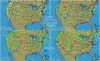
This current chart seems to be a good example of how areas of meterological phenomena (moderate turb [yellow dotted line] in this example) can be aligned with artificial man-made boundaries. It would be good to get an NWS insider perspective on this. Yes, paging Scott please.
RE: upper left panel
RE: upper left panel