- Joined
- May 24, 2016
- Messages
- 831
- Display Name
Display name:
4RNB
My plane is on the list for a new paint job. This will be done a reputable shop, full strip. I'd like some pointers or ideas on how to handle the color scheme.
Here is what I think I know:
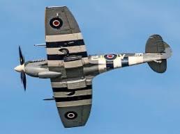
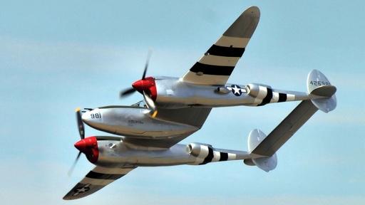
Red fades faster.
Colors add expense.
Reflective or fluorescent does not really help visibility in the air.
I can find minimal studies as to what impacts visibility.
C172M
Here is what I would like to accomplish:
Look good.
Protect the plane.
Not get too freaky such as to impact resale value too much (selling plane not expected).
Increase safety through improving visibility.
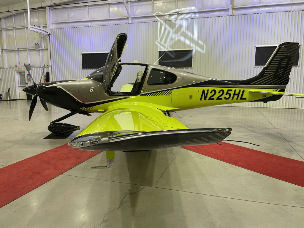
I'm thinking to get all white, simple contrast color or two.
Perhaps make bottom of wings, fuselage, elevator a darker color to improve vis from below. Not in the blue/grey spectrum unless really dark.
References:
https://apps.dtic.mil/sti/citations/AD0759419
full text: https://apps.dtic.mil/sti/pdfs/AD0759419.pdf
https://psycnet.apa.org/doiLanding?doi=10.1037/h0021963
What do you think?
Here is what I think I know:
Red fades faster.
Colors add expense.
Reflective or fluorescent does not really help visibility in the air.
I can find minimal studies as to what impacts visibility.
C172M
Here is what I would like to accomplish:
Look good.
Protect the plane.
Not get too freaky such as to impact resale value too much (selling plane not expected).
Increase safety through improving visibility.
I'm thinking to get all white, simple contrast color or two.
Perhaps make bottom of wings, fuselage, elevator a darker color to improve vis from below. Not in the blue/grey spectrum unless really dark.
References:
https://apps.dtic.mil/sti/citations/AD0759419
full text: https://apps.dtic.mil/sti/pdfs/AD0759419.pdf
https://psycnet.apa.org/doiLanding?doi=10.1037/h0021963
What do you think?